
BEST Website Design
UI/UX Design ・ Visual Design ・ Motion Design -2025 ・ https://www.besstx.com/
The BEST website was designed to present a highly technical service in a clear, accessible, and visually structured way. The goal was to build a digital presence that communicates reliability, operational clarity, and modern energy-storage expertise without overwhelming the user. Every page is shaped around guiding visitors quickly toward understanding what BEST does, how it works, and why the service matters.
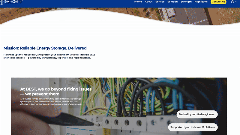
This project centered on creating a unified visual language that supports both professionalism and approachability. The color palette stays clean and minimal to reflect the engineering-focused nature of the company, while typography choices reinforce readability and hierarchy across dense technical information. Visual spacing, modular content blocks, and simplified iconography work together to make complex topics straightforward for any audience.
UI/UX Case Study- Project Overview
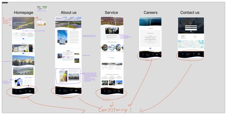
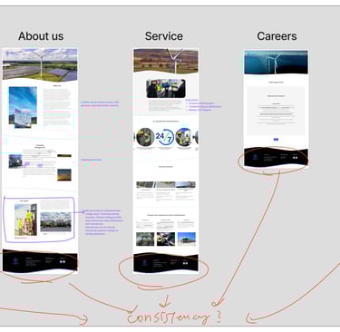
The original BEST website lacked a clear visual and structural system. Inconsistent color usage, weak hierarchy, and unconsidered UI/UX decisions made it difficult for users to navigate the site and quickly understand the company’s services. Key interface elements, such as the navigation bar, were not immediately visible, creating friction in the user experience.
Goal:
To redesign the website with a clear structure, cohesive visual identity, and user-focused interface that improves clarity, accessibility, and brand recognition.
Problems Identified
Disorganized layout and unclear content hierarchy
Inconsistent color usage with no strong brand anchor
Navigation bar lacked visibility and usability
UI decisions were made without considering user behavior
Visual identity did not clearly differentiate BEST from other energy companies
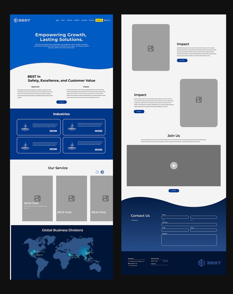
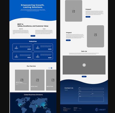
Layout & Structure
Color & Brand Identity
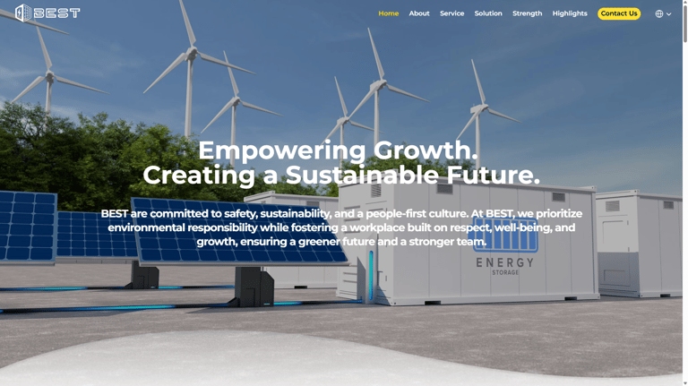
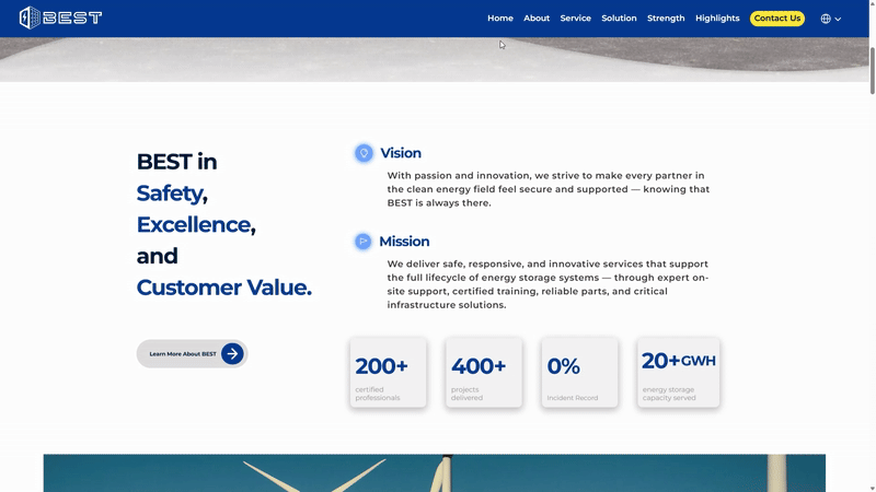
I began by identifying BEST’s existing brand assets and selected the logo color as the foundation of the new color system. Through research into other energy companies, I observed that green and orange are commonly used to communicate eco-friendliness and energy.
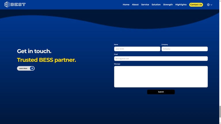
To create a more distinctive brand presence, I chose blue as the primary brand color. Blue communicates reliability, professionalism, and trust, while setting BEST apart from competitors. This choice helped establish a unique visual identity within the energy industry.
Visual Structure & Concept
I retained the wave element from the original website and elevated it into a core design structure. The wave serves both a functional and symbolic purpose:
It creates visual flow and rhythm across the layout
It reinforces a sense of motion and energy
It subtly references the ocean and environmental awareness
This approach communicates that while BEST operates in the energy sector, the company is dynamic, forward-thinking, and environmentally conscious.
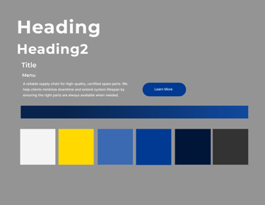

Style Guide
Layout
LOGO
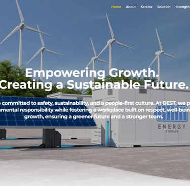
Hero Banner / Heading Section and Closing Section
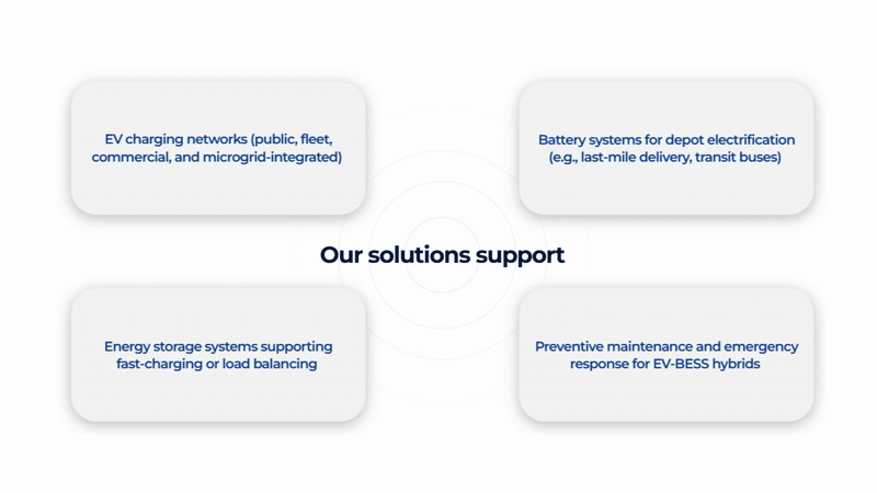
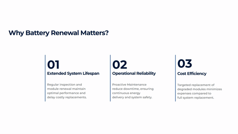
UI/UX Improvements
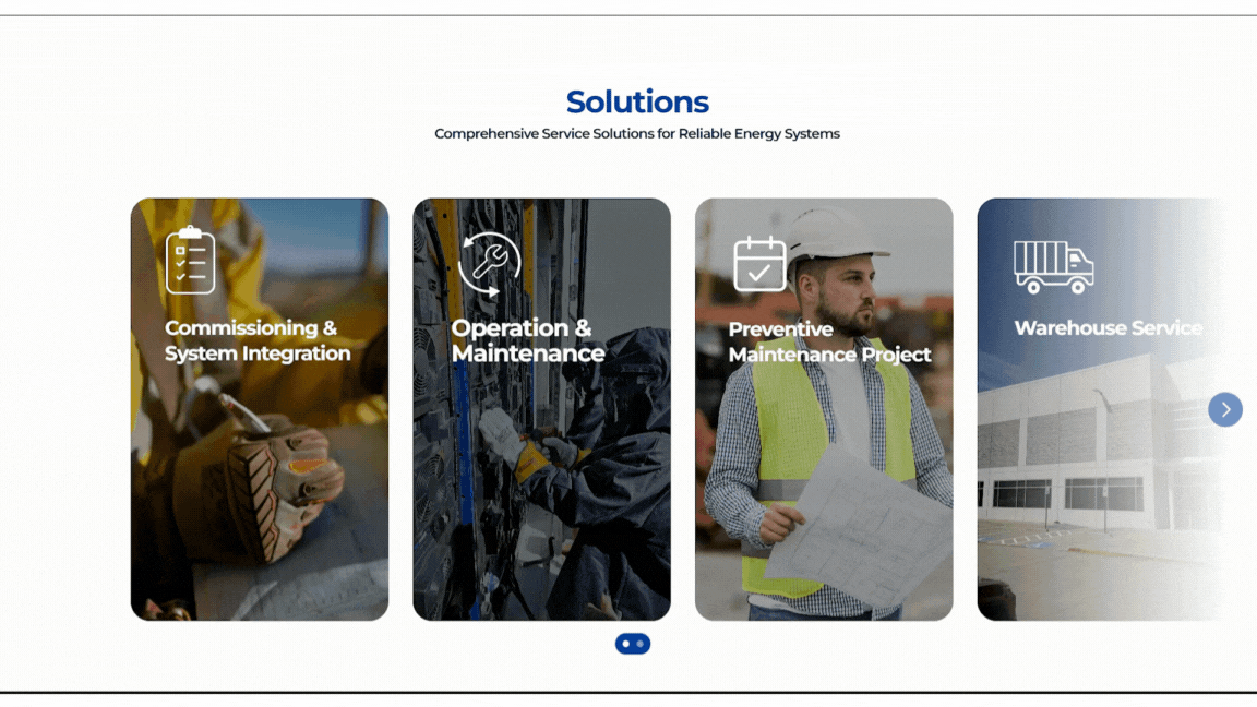
The UI/UX and interactive website design focus on creating a clear, intuitive user journey that improves usability and engagement. Interactive elements are used intentionally to guide users through the content, reinforce brand identity, and create a dynamic browsing experience without overwhelming the interface.
Visual hierarchy, spacing, and motion are carefully designed to support readability and navigation. Subtle interactions—such as hover states, animated transitions, and responsive feedback—help users understand where to focus and how to move through the site naturally.
Interactive design choices are driven by user behavior and storytelling goals, balancing functionality with visual interest to create an engaging and user-centered website experience.
Multi-Platform & Language Design
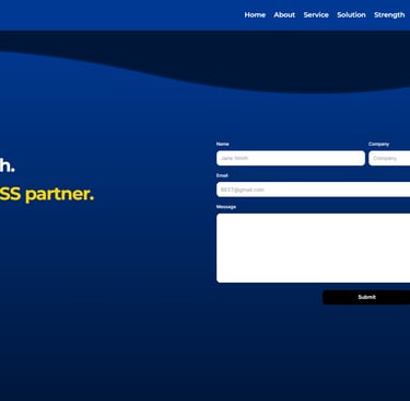
The website was designed to function seamlessly across desktop, tablet, and mobile devices while also supporting multiple languages to accommodate BEST’s expanding global reach. The layout and navigation system were structured to remain consistent across platforms, ensuring users experience the same clarity and usability regardless of screen size.
In addition to responsive design, the interface was built to support both Chinese and Spanish versions of the site. Typography, spacing, and layout flexibility were carefully considered to account for differences in text length and reading flow across languages. This ensures translated content remains visually balanced and easy to navigate without disrupting hierarchy or design integrity.

By designing for multiple platforms and languages from the start, the website supports international accessibility while maintaining a cohesive visual identity. This approach reflects BEST’s growth as a global-facing company and reinforces its commitment to clear communication across diverse audiences.
Multi-language : English, Simplified Chinese, Spanish
Results & Intended Impact
Improved clarity and navigation flow
Stronger brand identity through a cohesive color and visual system
Clear, accessible navigation supporting better user experience
Responsive layout maintaining visual order across all screen sizes
Design system that supports future scalability